
An easy way to visualize the distribution of stock returns is to plot a histogram. In this tutorial, we will teach you how to create histograms of stock returns using Excel and explain how to interpret them.
Contents
Using Excel’s “data analysis” tool to plot a histogram
We’ll be working with the monthly returns of two US stocks: Microsoft (MSFT) and Kellogg (K). To plot a histogram in Excel, you need to go to the “Data” tab and then click on the “Data Analysis” box. Note that if you haven’t used Data Analysis before, you need to make sure that the “Analysis ToolPak“, which is an Excel add-in, is enabled. Otherwise, the Data Analysis box wouldn’t initially appear under the Data tab.
Once you click on the Data Analysis box, choose the “Histogram” tool. You’ll then have to specify the “Input Range“, which are the cells in which the stock returns are stored. You can (but don’t have to) specify your own bins (the “Bin Range“) for the histogram. For example, if you generated a bin from −10% to −5%, the histogram would give you the number of return observations that fall within that range in the sample. It’s often a good idea to check the “Chart Output” option so that Excel automatically produces the histogram chart.
Interpreting histograms of stock returns
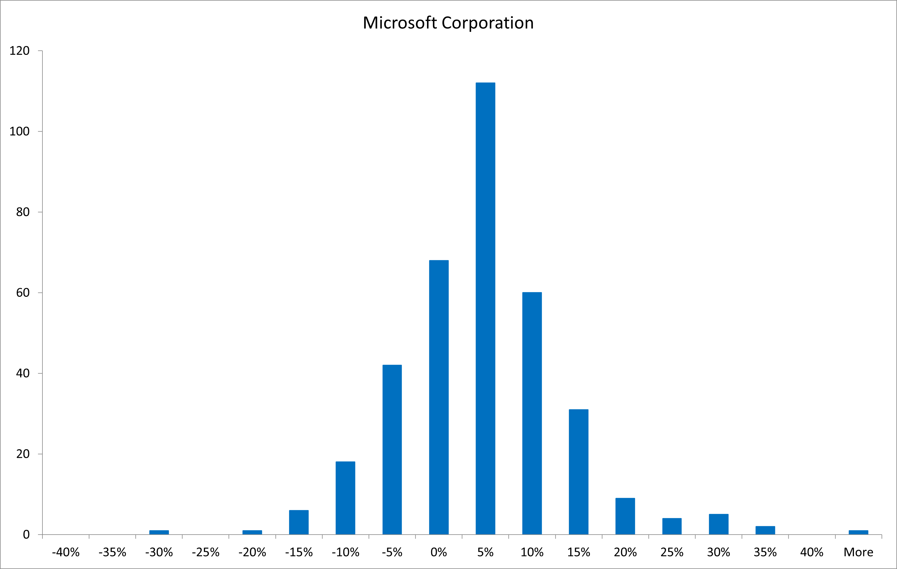
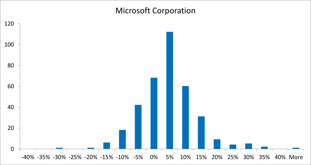
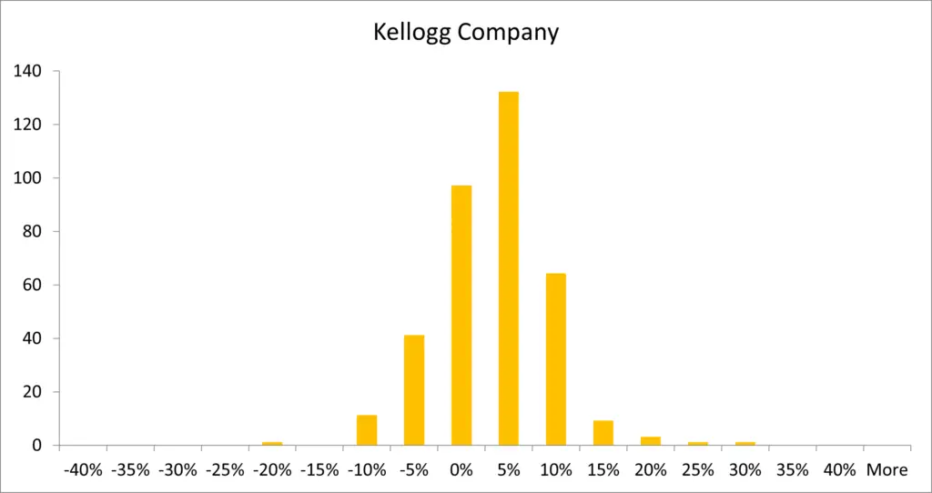
Below you can see the histograms of monthly returns for Microsoft (Figure 1) and Kellogg (Figure 2) for the period between January 1, 1990 and January 1, 2020. We observe that for both stocks most monthly return observations fall within the −5% to 10% range. However, there are differences between the return distributions of these two stocks as well: The distribution of Kellogg returns is more tightly centered around the mean compared to Microsoft returns, which are more spread out. In particular, there are more observations both below −5% and above 10% for the Microsoft stock compared to the Kellogg stock. This means that Microsoft shares had higher return volatility than Kellogg shares during the sample period.
Video tutorial
You can watch to video tutorial below to see how we produced the histograms shown in Figures 1 and 2.
Creating histograms with other statistical software
Of course, you can plot a histogram of stock returns using statistical software other than Excel as well. Here is a list of commands you can use in other popular statistical packages:
- Matlab: Enter hist(x) to create a histogram of the elements in x. You can add the option “nbins” for the number of bins.
- R: Use the hist(x) function where x is a vector of numbers. Option “breaks” can be used to define bar widths.
- SAS: You can use the HISTOGRAM statement after following the SGPLOT procedure and inputting your dataset.
- Stata: Use the histogram command (the option “bin” specifies the number of bins, “width” sets the width of bins, and “start” indicates the starting pointing of the first bin).
What is next?
This tutorial is part of the series on analyzing stock returns.
- Next tutorial: We’ll teach you how to obtain descriptive statistics for stock returns using Excel.
- Previous tutorial: We explained how to plot stock prices and returns.
Feel free to share this post if you enjoyed reading it. Also, please leave a comment if you notice any errors or have any suggestions/questions.
If you would like to find out more about histograms and how they can be used in areas other than finance and investments, have a look here: https://www.mathsisfun.com/data/histograms.html.