
In this tutorial, we’ll teach you how to plot time series of stock prices and returns using Excel. We’ll explain how to interpret these plots as well.
We’ve chosen to examine Microsoft (MSFT) and Kellogg (K) shares for the 30-year period between January 1, 1990 and January 1, 2020. The data is obtained from Yahoo! Finance as explained in the previous tutorial.
Contents
Time series plots of stock prices and returns in Excel
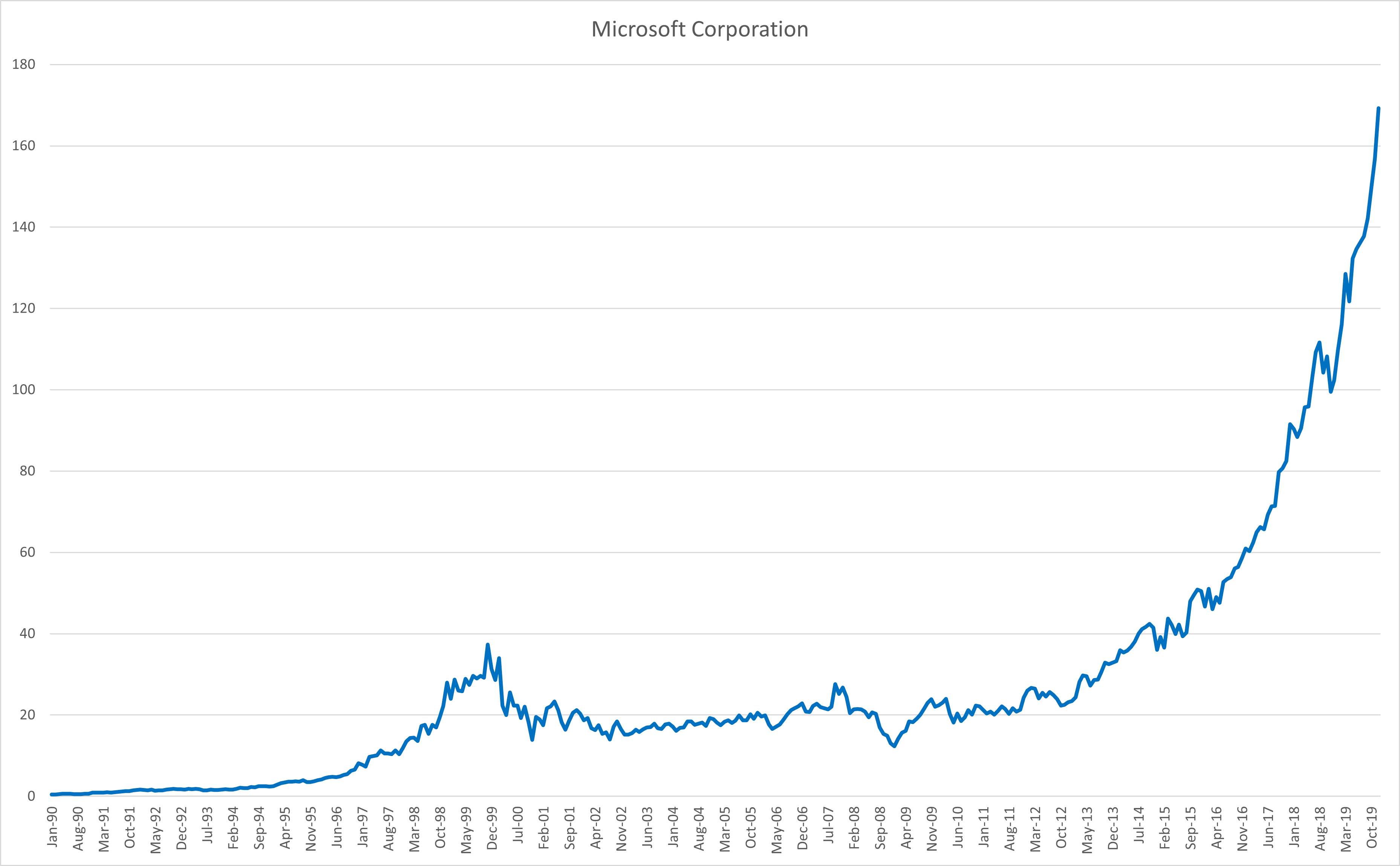
You can follow the steps below to plot stock prices and returns in Excel (see also Figure 1 below).
- Begin with storing the stock prices (or returns) and their dates in adjacent columns.
- Go to the Insert tab and click on the “line chart” icon.
- Next, click Select Data under the Chart Design tab.
- When the pop-up menu shows up, in the Chart data range field, enter the column with the stock prices (or returns).
- In the same pop-up menu, in the Horizontal (Category) Axis Labels field, enter the column with the dates.
- Click OK to produce the chart.
- You can use Add Chart Element (under the Chart Design tab) to edit the chart title, axis titles, and so on.
The video tutorial at the end shows how to apply these steps.

Time series of stock prices
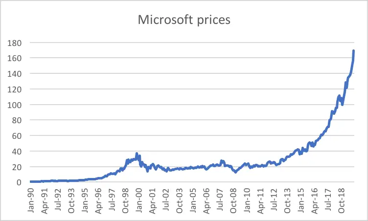
We begin with analyzing the monthly share prices of Microsoft (Figure 2). We observe impressive growth over the 30-year period, especially after 2012. However, it would be wrong to say that the increase in the share price has been smooth over the years. In fact, we can spot clear downturns, for example, during 2000 (around the burst of the Dot-com Bubble) and 2008 (the Credit Crunch).
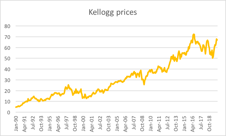
We observe an upward trend over the 30-year period for Kellogg shares (Figure 3) as well. Again, although the long-run trend is upward, there are lots of ups and downs along the way. This pattern is typical for stocks as they are sensitive to broad market movements.
Time series of stock returns
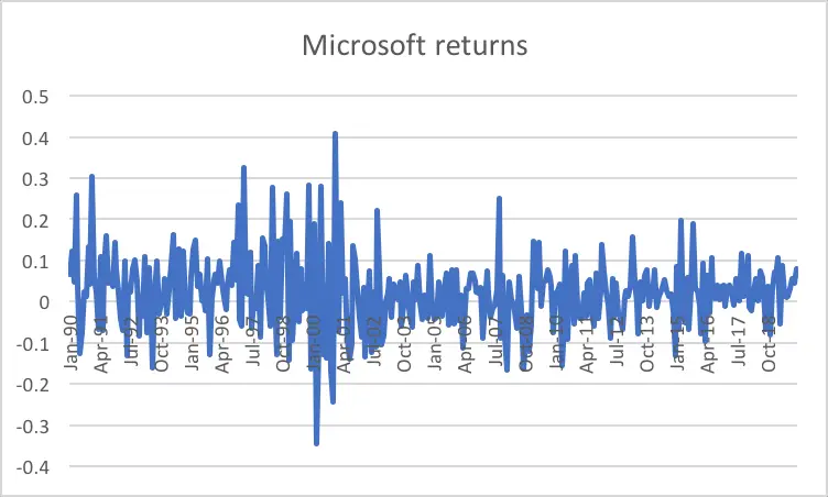
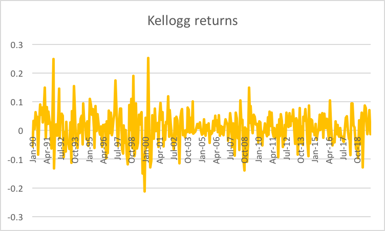
How about the monthly returns of these two stocks? When we examine the monthly returns of Microsoft (Figure 4) and Kellogg (Figure 5), we don’t observe an obvious trend, which was the case for monthly prices. Instead, we see sort of a “noise process”.
For Microsoft, most monthly returns lie within the [−30%, +40%] band. However, this doesn’t mean that more extreme returns won’t be observed in the future. In fact, stock return distributions tend to have “fat tails”, meaning that extreme returns are experienced more frequently than they would under a normal distribution.
For Kellogg, the corresponding return band is [−20%, +20%], which is narrower than the one for Microsoft. We can take this as a hint that the monthly returns of Kellogg shares are less volatile than those of Microsoft shares. We’ll investigate this further in our next tutorial.
Video tutorial
Below you can find a summary of the discussion above in a video format.
What is next?
This tutorial is part of the series on analyzing stock returns.
- Next tutorial: We will offer a step-by-step guide for creating a histogram of stock returns using Excel.
- Previous tutorial: We showed how to download stock price data from Yahoo! Finance.
Feel free to share this post if you enjoyed reading it. Also, please get in touch with us if you noticed any errors or have any suggestions/questions.